Showing posts with label aleksandr rodchenko. Show all posts

Wednesday, 22 October 2008

Rodchenko's Photomontages


These are photomontages by Rodchenko, 'And This Takes Centuries' Illustrations for Mayakovsky's Pro Eto in 1923.
They are created using found imagery and some of his own photographs, which creates an interesting mix of quality between the images. The layout of the imagery is interesting, how he has combined differing photos together, which is evident with the man holding the oversized spoons changing the perspective and taking away the sense of reality, which makes the collages work as one whole image.

'Woman with Leica' 1934


This photo, 'Woman with Leica' 1934 is my favourite photograph of Rodchenko's.


The use of the natural lighting is what makes this photo successful, the pattern that the light casts over the subject is very interesting and gives the photo a dark mood and a sense of isolation, as the pattern of light emphasises the empty space around the woman.
Rodchenko has also changed the viewpoint and taken the photo on a slight angle, which throughs the perspective off and makes it hard for the eye to understand the photo.


For this photo I was influenced by the photo by Rodchenko, using the pattern of natural light from the outside to light the space, I felt it added a natural element to a very man-made environment.

Rodchenko's Photography.


These are examples of Rodchenko's phototography, which is the area of his work I think is the most successful.
These are, 'Fire Escape on the house in Myasnitskaya Street' 1925, 'Pioneer' 1930 and 'House in Myasnitskaya Street' 1927. All these photos show how Rodchenko used extreme angles to capture his subjects, these being taking from below looking up at them. This creates really dynamic photos and changes how you perceive the subject, taking a fresh look on them.
The second photos are the most interesting, as the extreme angles takes away some of the context of the situations Rodchenko is photographing them in and creates a more ambiguous feeling. Allowing the viewer to figure out the context themselves, engaging them within the photo.


Textile Design 1924


This is a textile design in 1924 by Rodchenko, which I feel is really successful as the repeat pattern of the circles creates a very dynamic design.
The way he has drawn the circles, in a spiral form gives a 3D quality to it, which is emphasised by the circles overlapping each other. I really like the mathematical feel to the design and how the circles tessellate to leave diamond shapes in the free space.

Tuesday, 21 October 2008

Albidum 1927


He was the art director for the film 'Albidum' 1927 and designed the furniture, costumes and sets for it.
This is the design for the office set, which is a photograph with watercolour and lacquer. I really like the quality of the image more than anything, the process he used produced a printed effect, with rough/smudged areas. In the design, I like how he has contained the desk within the pattern on the floor and mirrors it in the layout of the desk, with the position of the two chairs.

Costume Design


Another area he experimented in was costume design, this the costume for the cafeteria waitress for Glebov's play 'Inga' in 1929.
These incorporate his constructivist design principles into a very different area of design. This is very clear on the strong geometric shapes on the dress and the blocks of flat colour within them.
Although, this wasn't his most successful area, it's interesting to see how he transfered his design aesthetic to very different areas.

Tea anyone?


Rodchenko experimented with pretty much every area of design, which get forgotten and are some of his best work.
This is a design for a cup and saucer from a series of designs for a tea set he did in 1922. I really like the geometric shapes, with the intersecting circles, creating a kaleidoscope effect. Also the orange and black work well together, making a very vibrant design.
Lets put it this way, I'd have it in my kitchen any day!

The Battleship Potemkin Poster 1925


This is my favourite Rodchenko design, 'Battleship Potemkin' 1925 an advertising poster for Sergei Eisenstein's film The Battleship Potemkin.

It is a very clever design, with the way he has used the two circles to create the feeling of binoculars, which allows the viewer to feel like they are watching the mutiny unfold on the ship and draws you into the poster. The contrasting styles of the flat/block colours of the background and the detailed images work really well together, breaking the poster up and creating the two focus points. The layout of the type is very considered and balences the poster well, having them centre aligned follows the design of the images and again draws you into the poster.

Although, I may be slightly biased as this is my favourite film! I also find it quite interesting that Rodchenko's innovations in lighting in his photography inspired Eisenstein and he in turn designed a poster for him.

Dobrolet Identity

Another of Rodchenko's work I think is very effective is his designs for the airline Dobrolet's identity. He created the logo, letterhead and advertising posters.

The logo in particular is very well designed, using a simple idea of the front view of a plane and placing the typography on the line created by the top of the plane. This creates a very compact design and is the most effective use of the space. I really like how he has used a very geometric design for the plane, which compliments the design of the type. He has created a clear identity through the use of only red and blue colours, so any material in connection to Dobrolet can be designed using these colours and can be clearly identified.

This is an advertising poster he designed for Dobrolet, it uses the two colours of red and blue to echo the design of the logo.
Within this, the imagery is really effective, especially how he has created the perspective of the squares going off into the distance, giving the poster a sense of depth.
The typography layout is quite interesting, especially the type on the right side where he has set the last 3 lines in slightly. Although this is probably because the globe was in the way, but it works.

Early Design Work


This is a hand painted poster Rodchenko made for a solo exhibition in 1917.
It shows his early use of typography and design, it looks pasted together and and messy. Although the messy quality it has is the one that draws you to the poster, it's got a spontaneous feel to it, which is emphasized by the handmade quality of the lettering.
This is very different to any of his other design work, as it doesn't have the strong constructivist quality of precision and geometry. Instead this reminds me of Ed Fella's designs, with the handmade lettering and slightly off line angle of the words.

The Painting Years


These pieces are early paintings by Rodchenko, the first is 'Composition on yellow ground no. 89' painted in 1919 from a series called 'Lines' I really like the simplicity of this, using only white lines to create the imagery. He has created a 3D effect by having the diagonal straight line and then slowly changing the position of the lines intersecting it, to make it appear as though it is starting to curve in on itself.


The second and third are, 'Construction no. 106 and 107' painted in 1920, with these he has expanded on the idea in the first of creating 3D elements with geometric shapes. This is especially evident on the latter with the overlapping circles, to create a tubular effect.


I took the influence of overlapping shapes to create a 3D effect for my poster for my Elastypography project. I overlapped the letter a, rotating it slightly to create a spiral effect, drawing your eye into the poster.

Lilya's Influence


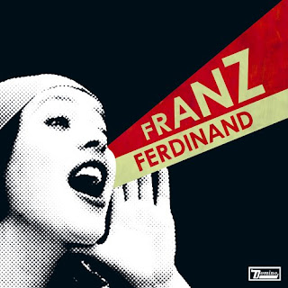
Rodchenko's 'Lilya Brik' poster has been the influence of many contemporary designs, Franz Ferdinand based their album cover art for You Could Have It So Much Better on this poster, using the same basic structure. This works very well for the cover as it would grab people's attention, although the design doesn't work as well because of the mouth and type aren't aligned, so some of the effect is lost.


The album cover art for The Ex's 6 Series are all based on Rodchenko's 'Lilya'
These are a bit crudely put together, although all follow the same basic structure of Rodchenko's poster. The first is the most successful as they use the exact same design, just replacing the text and images. The third doesn't work very well and looks very cluttered and the constructivist aesthetic is lost.

Lilya Brik Poster 1924


This is Rodchenko's most iconic piece of work, a 1924 advertising poster using the portrait of Lilya Brik.
Within this poster; Rodchenko has made the typography work with the portrait, almost turning it into an image itself. The layout of the type on this poster is what makes it work, as every type element has been carefully considered to intergrate them within the poster.
I also like how he has divided up the space, using shapes and colour, which creates a lot of impact and draws your attention to the portrait as it contrasts the vivid colours of the background.

Friday, 17 October 2008

Aleksandr Rodchenko

For the Typography project, I picked Aleksandr Rodchenko. In short he was a russian artist/ designer/ photographer/ costume designer/ textile designer, well he covered a wide range of areas in his life.

Above is an extract from a documentary about Rodchenko by Michael Craig, it focuses on his transition from painting to photography and how he was searching for a better way to show the social reality of the time. It's a nice introduction to Rodchenko, to give you a little background to him.