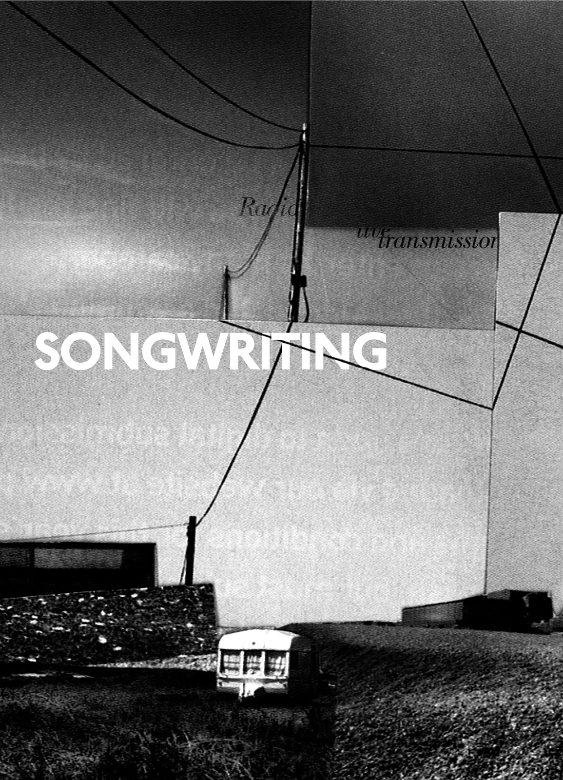
Monday, 29 November 2010

Screenprinting!

Last Monday we had a screen printing introduction, crazy as I’m a 3rd year. Such a shame we’ve not had access to this before, or been aware we have because we had great fun making some simple prints using simple paper stencils and luminous green paint! Now myself and Amy want to frame this baby, lovely a2 print goodness.

Friday, 26 November 2010

Recorders by Rafael Lozano-Hemmer


Photos from an interactive exhibition called Recorders at the Manchester Art Gallery by Rafael Lozano-Hemmer.

Amazing works which used heartbeats , sound, scanners, communication and projection to create an immersive experience.

Wednesday, 17 November 2010

Community

Sneak peak of mine and Amy's community project!

GIF

Tuesday, 2 November 2010

AM/PM

Just finished this brief for uni, we were asked to take the title AM/PM and either create a title sequence for BBC4 or as I chose to create an interactive kiosk design.
I took this and adapted it to an installation based on the idea of space and time. I then decided to create the installation for the science museum as a way for kids to learn about the solar system, called "Solus". The installation puts you in the position of the planet, the interaction involves you walking on the floor interface and when you stand on the name of a planet it triggers the sun, represented by a wall of light, to be brighter or dimmer depending on which planet you have stepped on. Then at the same time the temperature of the room changes in accordance to the planet you are stood on


Then this is a video animation of how the floor interface changes when you step on a planet and trigger the interaction.

Saturday, 30 October 2010

CV: self promotion


CV time.
Here's my design for our recent CV project, I decided to go big but simple in the design... and by big I mean 2 meters.
Printed on the plotter double sided, which was a nightmare but I got it to work with a lot of help from the technician, so all in all worth it.
The design is on the front, my CV: about me, qualifications, experience, contact etc etc. Then on the back is a kind of wallpaper design, as the size of it reminded me of wallpaper and could then be something that the recipient could put up, the design became a play with typography saying "employme" repeated in an op art pattern down the length of the paper.

Click through for more photos:


Thursday, 7 October 2010

Studio View Work Experience

I recently spent a week at the design agency Studio View based in Lincoln. While I was there I was given a project to produce illustrations for songwriting.
I decided to use a collage approach and choose famous songwriters as the basis for them. I chose Ian Curtis and Joy Division, Patti Smith and Robert Smith of The Cure, the collages then became inspired by a song of theirs I felt showcased their songwriting skills best. For Ian Curtis I chose Transmission and the collage shows the industrial style and the idea of telephone wires all connecting together. For Patti Smith I chose Land and the collage shows the imagery of the song, which the horse and the flames and the boy with a butterfly coming from his mouth. For Robert Smith I chose Pictures of You and the collage shows an underwater style, with aqua colours, it consists of an image of a woman floating underwater and then behind it is green card and a piece of scourer, then over this I placed a grey film to give a more murky effect.

Mail Art: Presentation

We presented all of the mail art together on a line of tables, it was really cool getting to see everyone's work in an informal way and actually letting the students open the letters all round the table created a great atmosphere of discussion.
Click through for more...

Mail Art: University

This was in response to the question "should university education be free?" I chose the idea of sending a statement of the debt that they will have after 3 years of university and I then expanding this further by thinking of the packaging and making it so it was first wrapped in loads of brown paper and then wrapped in string and then wrapped in sellotape and finally more string. It shows the idea of working so hard to get through university and what you finally get from them is a huge debt.

Mail Art: World Population

 This was in response to the question "how many people should there be?" I chose to go down a more symbolic route and started thinking about the idea of something that is ever expanding and then the idea of this expansion being restricted, like the earth is restricting the limit of population expansion. From this I came up with the idea of placing an elastic band around a balloon which when blown up restricts the user and makes blowing up the balloon near impossible.