Tuesday, 28 October 2008

Special Guest Stop Motion


This is amazing-- http://www.specialguest.tv/ and click on the Special Guest link on the right hand navigation.

It's a stop motion animation by Special Guest using crochet to create the characters, it must have taken a long time to do but the result is really effective.
The start is the best part, as it's really simple and the sounds of the crochet give an eery atmosphere.

www.ertdfgcvb.ch


Check out this-- http://www.ertdfgcvb.ch/ its got some pretty cool interactive works (and the sites quite nice too)
Andreas Gysin has created this site for his experiments and ideas for interactive projects using shockwave and processing, among others. And if anyone can complete the fan and ball game, tell me your secret!
Also, there are some really useful links on page 3 for interactive designers.

Monday, 27 October 2008

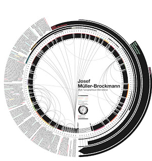
Quentin Delobel


This is a visualisation Delobel produced as the result of research he had done on Josef Muller-Brockmann. I really like how he has designed the research in Brockmann's style, the circular structure is really interesting and makes you explore it to find out what it is about, which engages you into the design. It presents the information in a way that would appeal to the viewer to read it.

Check out his website http://www.quentindelobel.com/, most of it's in french but there are some really nice visuals. I especially the books he has made.

This book, entitled 'Des idées reçues' is very well made and has a simple cover design, I really like how he has embossed the text on a piece of metal, which adds a new visual element to the design.


I also like this book, called 'Paris, mai 68' the cover is handprinted text saying paris, it has a rough and textured finish which works really well. The inside layout is also really interesting as he has used fold outs and double page spreads of a single letter, making the book focused on the visuals over everything else.

Wednesday, 22 October 2008

Rodchenko's Photomontages


These are photomontages by Rodchenko, 'And This Takes Centuries' Illustrations for Mayakovsky's Pro Eto in 1923.
They are created using found imagery and some of his own photographs, which creates an interesting mix of quality between the images. The layout of the imagery is interesting, how he has combined differing photos together, which is evident with the man holding the oversized spoons changing the perspective and taking away the sense of reality, which makes the collages work as one whole image.

'Woman with Leica' 1934


This photo, 'Woman with Leica' 1934 is my favourite photograph of Rodchenko's.


The use of the natural lighting is what makes this photo successful, the pattern that the light casts over the subject is very interesting and gives the photo a dark mood and a sense of isolation, as the pattern of light emphasises the empty space around the woman.
Rodchenko has also changed the viewpoint and taken the photo on a slight angle, which throughs the perspective off and makes it hard for the eye to understand the photo.


For this photo I was influenced by the photo by Rodchenko, using the pattern of natural light from the outside to light the space, I felt it added a natural element to a very man-made environment.

Rodchenko's Photography.


These are examples of Rodchenko's phototography, which is the area of his work I think is the most successful.
These are, 'Fire Escape on the house in Myasnitskaya Street' 1925, 'Pioneer' 1930 and 'House in Myasnitskaya Street' 1927. All these photos show how Rodchenko used extreme angles to capture his subjects, these being taking from below looking up at them. This creates really dynamic photos and changes how you perceive the subject, taking a fresh look on them.
The second photos are the most interesting, as the extreme angles takes away some of the context of the situations Rodchenko is photographing them in and creates a more ambiguous feeling. Allowing the viewer to figure out the context themselves, engaging them within the photo.


Textile Design 1924


This is a textile design in 1924 by Rodchenko, which I feel is really successful as the repeat pattern of the circles creates a very dynamic design.
The way he has drawn the circles, in a spiral form gives a 3D quality to it, which is emphasised by the circles overlapping each other. I really like the mathematical feel to the design and how the circles tessellate to leave diamond shapes in the free space.

Tuesday, 21 October 2008

Albidum 1927


He was the art director for the film 'Albidum' 1927 and designed the furniture, costumes and sets for it.
This is the design for the office set, which is a photograph with watercolour and lacquer. I really like the quality of the image more than anything, the process he used produced a printed effect, with rough/smudged areas. In the design, I like how he has contained the desk within the pattern on the floor and mirrors it in the layout of the desk, with the position of the two chairs.

Costume Design


Another area he experimented in was costume design, this the costume for the cafeteria waitress for Glebov's play 'Inga' in 1929.
These incorporate his constructivist design principles into a very different area of design. This is very clear on the strong geometric shapes on the dress and the blocks of flat colour within them.
Although, this wasn't his most successful area, it's interesting to see how he transfered his design aesthetic to very different areas.

Tea anyone?


Rodchenko experimented with pretty much every area of design, which get forgotten and are some of his best work.
This is a design for a cup and saucer from a series of designs for a tea set he did in 1922. I really like the geometric shapes, with the intersecting circles, creating a kaleidoscope effect. Also the orange and black work well together, making a very vibrant design.
Lets put it this way, I'd have it in my kitchen any day!